Creating Depth with Mixed Media Layering Techniques
Imagine you’ve just finished a watercolor painting, but it looks flat—a thin, one-dimensional wash of color that lacks punch. You want that sense of physical weight and visual depth, but every time you add a new layer, the colors turn into a muddy mess. This guide breaks down the mechanics of mixed media layering, specifically how to stack different textures and mediums to create professional-grade dimension without ruining your base layer.
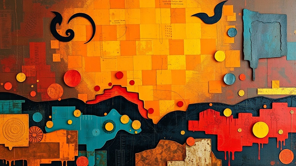
Layering is more than just putting one thing on top of another. It’s about understanding how light interacts with different surfaces—matte, gloss, grit, and transparency. When you do it right, your art looks like it has a soul. When you do it wrong, it looks like a pile of scrap paper.
What Materials Do You Need for Mixed Media Layering?
You need a mix of absorbent surfaces, liquid mediums, and solid textures to create successful depth. While you can start with basic acrylics, professional results often require specialized tools like heavy-body gels, modeling pastes, and various types of paper.
I always tell my students to start with a sturdy substrate. If you're using thin watercolor paper, a heavy layer of acrylic gel might cause it to buckle. For heavy texture, look toward mixed media techniques that utilize wood panels or heavy-duty canvas.
Here is a quick checklist of the essentials I keep in my studio:
- Heavy Body Acrylics: Brands like Golden or Liquitex are standard for a reason; they hold their shape.
- Modeling Paste: This is your best friend for building physical height.
- Gesso: Use this to prime surfaces and ensure your paint actually sticks.
- Collage Elements: Old book pages, tissue paper, or even dried botanicals.
- Mediums: Gloss gel, matte medium, and perhaps some iridescent texture paste.
Don't feel like you need to buy the most expensive kit right away. You can actually find some of the best textures in your own recycling bin—think corrugated cardboard or even crushed eggshells (though that’s a bit more experimental). If you're interested in more organic textures, you might enjoy reading about unexpected materials for high-end textural art.
How Do You Layer Without Making Colors Muddy?
To avoid muddy colors, you must layer from the most opaque (solid) materials to the most transparent (see-through) materials. If you try to put a transparent wash of watercolor over a thick, opaque layer of heavy-body acrylic, the paint will just sit on top and won't "sink in" the way you'd expect.
The secret is the "Opacity Rule." Think of your layers like a window. The first layer is the view, the second layer is the glass, and the third layer is the tint. If you start with a dark, thick layer and try to put a light, thin layer over it, the dark color will always win.
The Order of Operations:
- The Base: Start with your widest, most forgiving colors. This could be a thin wash of ink or a light acrylic tint.
- The Texture: Apply your modeling paste or heavy gels. This is where you build the "hills and valleys" of your piece.
- The Middle Layers: Add your collage elements or patterned papers. These add visual interest without changing the physical height too much.
- The Glaze: Use a translucent medium or a very thin paint layer to "tie" the colors together. This acts like a filter over the whole piece.
One thing to watch out for: drying time. If you apply a wet layer over a semi-wet layer, they will blend. If you want distinct lines, wait for the first layer to be bone-dry. It's a test of patience, I know—but it's worth it.
How Much Texture Is Too Much?
Too much texture happens when you lose the focal point of your artwork to a chaotic mess of bumps and ridges. A balanced piece uses texture to guide the eye toward a specific area, rather than making the viewer's eyes jump around the entire page.
I often see beginners overdo it with the modeling paste. They build up a huge mound in the center, and suddenly the "art" part is buried under a mountain of white paste. (I've definitely been there, and it's frustrating!)
| Technique | Visual Effect | Best Used For... |
|---|---|---|
| Light Glazing | Subtle, translucent depth | Adding a "glow" or mood to a background. |
| Collage/Paper | Flat, graphic interest | Introducing text, patterns, or vintage vibes. |
| Modeling Paste | High physical relief | Creating a focal point or a 3D sensation. |
| Dry Brushing | Highlighting edges | Making existing textures "pop" under light. |
If you want to experiment with how light hits these surfaces once you're done, you'll need to think about how you present the work. I previously wrote about capturing your handcrafted vision through photography, which is a great way to see how your new textures react to light.
What Are the Best Ways to Use Transparency?
Transparency is the tool that creates "optical mixing," where the eye blends two colors together because they are layered rather than physically mixed on a palette. You can achieve this by using acrylic mediums or very thin watercolor washes.
A common mistake is using too much water when working with acrylics to create transparency. Water can make the paint "bead up" or run off the surface. Instead, use a dedicated "glazing medium." This keeps the paint viscous and even while still allowing the bottom layer to show through.
It's a delicate balance. If you use a high-gloss medium, the layer will look deep and wet. If you use a matte medium, the layer will look soft and velvety. I personally love using a bit of both—a glossy base with a matte top layer—to create a sense of sophisticated contrast.
That said, always check the compatibility of your mediums. For example, if you are working with highly specialized organic materials, you might want to look into mixing natural pigments from kitchen scraps to see how they behave when layered with different binders. Natural pigments can be finicky, especially when you start adding heavy gels or pastes into the mix.
The most important thing to remember is to keep experimenting. Don't be afraid to ruin a piece. Sometimes the best layers happen by accident, and even a "failed" experiment can become a beautiful, textured background for your next project.